For awhile now I’ve been trying to create a new section in my blog dedicated to highlighting out others’ UI blunders in an attempt to learn from mistakes past made.
Let’s take a look at iTunes 11 today and point out the things that seemingly don’t matter, but really do.
A list of tracks in iTunes 11
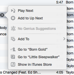
Remember that damned “Show more” button that originated in this world as the dreaded Ping button? It’s more annoying than ever because of its readjustment a space and a half after the track names.I’m going to coin a term here: tail-clicking effect. Tail clicking effect is a symptom of iTunes (and OS X), caused by the ability to double click to edit list elements. To make up for this effect, I place my cursor after the track name, double click, and…
Just kidding, let’s open this, instead.
Cool! A window dedicated to working with the track in iTunes! Oh wait…
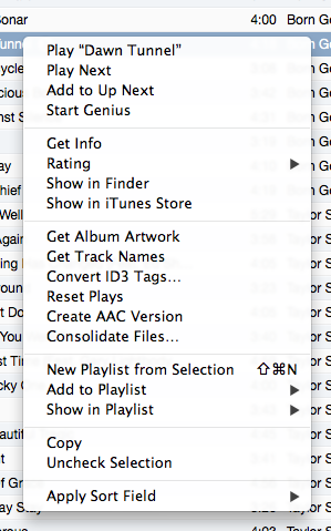
Remember this guy?
But do you want to know what the worst part is? That button has a delay in showing after cursor hovers over a track (about half of a second to give an idea). So, when clicking a track in the list, your first click makes it to the row, selecting it, but the second is caught by the button, popping open a useless and duplicated functionality menu that seems to lack the ability to even play the song you’re attempting to pick.
Everything in an iTunes list grid is bound to a column except that damn button. To me, it’s almost as if the iTunes 11 designers were trying to break rules when they refreshed the design. To be different, maybe? But it’s sad to know that while we were waiting for a refreshed player, they wasted precious time and resources working on a useless UI element when they could have invested that time making sure useful features remained.


