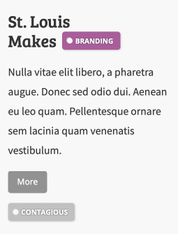
Across this website, you’ll see badges and some of these badges are attached to text. One of the annoying side effects I started seeing late into the design during mobile revisioning was weird, broken badges: as the container condensed, it would cause elements, such as div, span, or an img, to break into new lines, pushing my labels at the start of the next line and causing a cruddy overhang.

As you can see, this can be particularly unsightly when combined with some tight layouts and it would take some challenging CSS to make look normal. My solution? Attach it to the last word.
The solution
In a perfect world, we’d be able to wrap the final word in a span and use simple CSS to prevent breaking of the two apart:
<h2>Saint Louis <span>Makes<tag \></span></h2>
span {
    white-space: nowrap;
}
but the content in the blog is entirely dynamic, and using PHP to wrap header tags on output, while possible, was unfeasible.
The key: the non-breaking zero-width character  to join more characters together in a span that is no-wrapped. Instead, we can format out HTML output like this:
<h2>Saint Louis Makes<span><tag \></span></h2>
The key is the lack of space between the two word components, which with white-space: nowrap; will pull the last word to the next line with the badge as one combined unit.
That’s it! Everything looks much better now:
