The Theme Editor
The Theme Editor on iPadOS
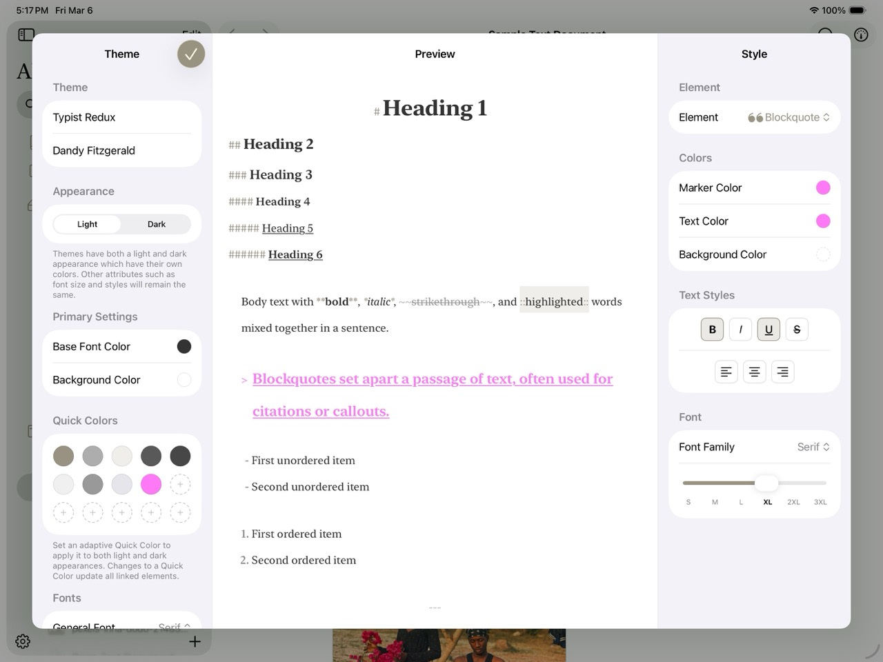
The Theme Editor lets you control exactly how the markdown editor looks — from background colors and font choices down to the color of individual syntax markers. It's a three-column interface with global settings on the left, a live preview in the center, and per-element styling on the right. Every change you make is reflected in real time.
To get started, go to Settings > Editor Styles and either duplicate a built-in theme or create a new custom theme.
Info
On compact screens (iPhone or narrow iPad layouts), the three columns become swipeable panels so you can still access all controls.
Overview Panel
The left column is where you set the foundation of your theme. Start by giving it a name and author, then work through the global settings:
Appearance mode — Use the Light/Dark toggle to edit colors independently for each appearance. The entire editor shifts to match the selected mode, so you're always seeing exactly what your readers will see.
Base colors — Set the default font color and background color for the current appearance. These serve as the starting point that individual element styles can override.
Quick Colors — A palette of up to 15 reusable color swatches arranged in a grid. The real power here is linking: connect a Quick Color to multiple element properties, and changing that one swatch updates every linked element at once. Light and dark appearances each maintain their own palette.
General Font Family — Choose System, Serif, or Monospace as the default typeface. Individual elements can override this in the Style Panel.
Live Preview
The center column shows a rendered markdown preview that updates in real time as you adjust settings. Rather than toggling back and forth between an editor and a preview, you see the effect of every change immediately — a different heading color, a new font family, adjusted marker opacity — all reflected as you work.
Info
If you try to leave the Theme Editor with unsaved changes, Atlas prompts you to Save, Discard, or Cancel — so you won't accidentally lose your work.
Style Panel
The right column is where you style individual markdown elements. A dropdown picker at the top lists every stylable element, grouped by category:
| Category | Elements |
|---|---|
| Headings | H1 through H6 |
| Formatting | Strong (Bold), Emphasis (Italic), Highlight, Strikethrough |
| Lists | Unordered (Dashed), Ordered (Numbered) |
| Blocks | Blockquote, Link, Image, Divider |
| Code | Inline Code, Code Block, Inline Equation, Equation Block |
| Annotations & Footnotes | Annotation, Footnote |
| Tables | Border, Header Background, Header Text, Row Background, Alternate Row Background, Selected Cell |
Select an element to reveal its available controls. Atlas only shows the controls that apply to that element — you won't see alignment options on a link, or border options on a heading.
What You Can Customize
Marker Color — The syntax delimiter color. This is the # in headings, the ** in bold, the > in blockquotes — the characters that define the formatting. Adjusting marker color separately from text color lets you make syntax visible without it competing with your content.
Text Color — The color of the actual content text for that element.
Background Color — An optional highlight behind the element. Supports transparency, so you can create subtle tinted backgrounds that don't overwhelm.
Border and Selection — For interactive elements like links, annotations, footnotes, and images, you can set border color and selection states (selected text color and background). These control how the element looks when you click into it. Equation elements (Inline Equation and Equation Block) also expose selection states but do not have border controls.
Font Traits — Bold, italic, underline, and strikethrough toggles. Some elements have locked traits — Strong always has bold enabled, Emphasis always has italic — but you can layer additional traits on top.
Alignment — Left, center, or right, available for headings, body text, and blockquotes.
Font Family and Size — Override the global font family on a per-element basis, and choose from preset size steps (S, M, L, XL, XXL, XXXL).
Info
Colors are per-appearance — light and dark are independently editable. Font traits, alignment, and font family are shared across both appearances.
Tables
Selecting Table in the element dropdown reveals a Table Colors section with six independent controls:
| Control | What It Colors | Clearable |
|---|---|---|
| Border | Grid lines between cells | No |
| Header Background | Fill behind the header row | Yes |
| Header Text | Text in the header row | No |
| Row Background | Fill behind body rows | Yes |
| Alternate Row Background | Fill for every other body row (zebra striping); clearing disables alternation | Yes |
| Selected Cell | Highlight behind the currently focused cell | Yes |
Table colors are per-appearance — light and dark edit independently.
Color Picker
Every color control in the Theme Editor opens the same multi-mode picker, giving you several ways to find the right color:
Grid — A palette of curated swatches for quick selection. Good for picking from a set of known-good colors.
Spectrum — A 2D saturation/brightness field with a hue strip along the edge. Drag to explore colors visually.
Sliders — Channel-based sliders supporting four color spaces — HSB, HSL, RGB, and CMYK — with a hex input field for precise values.
An optional alpha slider provides transparency control for any color.
Mac Tip
On Mac, you can drag colors into the Theme Editor from external applications like the system color panel or design tools like Figma.
Sharing Themes
Custom themes can be shared between devices and with other Atlas users:
Exporting — Share a theme as an .atlastheme package via the Share Sheet. The package bundles preview images so recipients can see what the theme looks like before importing it.
Importing — Open an .atlastheme file via the file picker or the system open mechanism to add it to your theme library.
Ulysses themes — Atlas can also import .ultheme files, automatically converting them on import. Both .atlastheme and .ultheme are registered as supported document types on iPad/iPhone and Mac, so they open directly in Atlas.
See Also
- Customizing the Editor — Theme selection and editor settings
- Writing with Markdown — The formatting elements you're styling