The Canvas
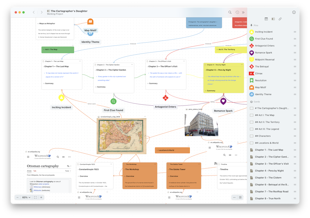
A wonky large canvas
Canvas documents are spatial workspaces for arranging content visually. Place document cards, folders, text blocks, images, live web pages, and pin markers on the canvas, gather related items into groups, then draw connections between them to map relationships.
Creating a Canvas
Create a new canvas from the Organizer using the context menu or from the File menu on Mac and iPadOS. The canvas opens as a blank workspace and grows as your content expands.
Adding Content
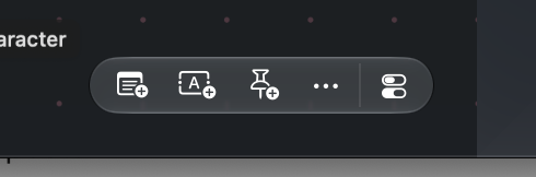
The buttons to add cards quickly to the canvas
A floating bar in the bottom-right corner of the canvas lets you add new items. Its buttons are:
- Add Existing Document — Search for a document by name, tag, or metadata and place it on the canvas
- Add Text Block — Add a freeform text block
- Add Pin — Add a pin marker
- Add Media () — Add photos or files, or a web page
Click or tap a button to add the item at the center of your view, or drag a button onto the canvas to drop the item exactly where you want it. On Mac, the bar also holds the Canvas Options button, which opens the canvas settings. On iPad and iPhone, Canvas Options lives in the navigation bar.
You can also add items from the background menu. Right-click empty canvas on Mac, or tap empty canvas on iPad and iPhone, to add a document, pin, text block, group, or media at that spot. The Editor menu has the same commands under Canvas > Add to Canvas, with keyboard shortcuts of Cmd+Shift+A (document), Cmd+Shift+B (text block), and Cmd+Shift+P (pin).
You can also drag documents from the Organizer, or images and media from Finder and Files, directly onto the canvas. Newly added and dropped items are selected automatically so you can adjust them right away.
Canvas Content
The canvas supports several content types to help you visually represent your project. All canvas items share common interactions:
- Moving — Drag any item to reposition it on the canvas
- Resizing — Drag the resize handles on an item's corners and edges to change its size
- Locking — Lock an item to prevent accidental movement or resizing
Select an item and a floating selection bar appears above it with the actions that fit that item, such as changing its color, locking it, or removing it. Open the bar's menu for more options. On Mac you can also right-click an item for the same menu.
Document Cards
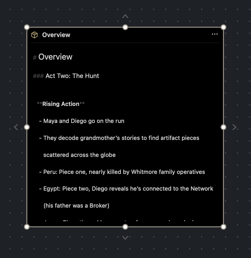
Document Reference Card with the editor active
Drag a document from the Organizer onto the canvas, use Cmd+Shift+A, or choose Add Existing Document from the add bar to place a document reference card. Cards can also be converted into pins and back while keeping their settings.
When unlocked, document cards can be edited directly on the canvas. Select a card, then click or tap into it to start writing without leaving the canvas. A card whose text overflows scrolls when it is selected, even before you start editing.
A card's display options live together under Display as in its menu. From there a document reference card can display either:
- Document — Shows the full document content
- Synopsis — Shows only the document's synopsis, with an italic title so synopsis cards are easy to tell apart
The same menu holds Convert to Pin, which turns a card into a pin marker (and back) while keeping its settings.
You can also assign a color to any card from a palette of six quick colors or choose a custom color. Atlas subtly tints a card's border with its color and can adjust colors that would be hard to read in light or dark mode. See Canvas Settings.
On Mac, a document card's menu offers a combined removal. With the menu open, hold Option and Remove Card becomes Remove Card and Document. Choosing it takes the card off the canvas and moves its underlying document to the Trash. Atlas asks you to confirm first, and the document can be restored from the Trash afterward. On iPad, hold Option on a hardware keyboard.
Folder Cards
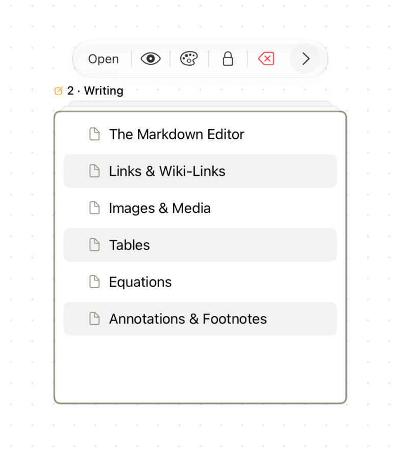
Folder on the Canvas
Add a folder to the canvas and it appears as a stacked card that shows the folder's contents as a live outline. The outline works like the Folder Outline: expand and collapse subfolders, and the expanded state is shared with the folder itself.
With the folder card selected, you can:
- Click or tap a row to select it, and double-click or double-tap to open that document
- Press Enter to open the selected row
- Use the arrow keys to move through the list. Up and down move between rows, left collapses a folder or moves to its parent, and right expands a folder or moves to its first item. Press Esc to clear the row selection.
- Drag a row out onto the canvas to create a card for that document
Until you select a row, the arrow keys nudge the card itself. Zoom far out and the stack collapses to a single layer to keep dense canvases readable. Choose Synopsis from Display as to show the folder's synopsis instead of its contents.
Text Blocks
Add freeform text blocks with Cmd+Shift+B. Text blocks support full markdown formatting and are ideal for annotations, notes, and visual labels on your canvas.
Text blocks can toggle their background visibility through the menu, letting you display text without a card behind it.
When a text block grows into something more, choose Convert to Text Document from its selection bar or from Editor > Canvas. Atlas suggests a title from the label's first line, and the text block becomes a document reference card in the same position, keeping its color and connections. The new document is filed under the canvas.
Pin Markers

Marker Pins on a Canvas over a Map image
Add lightweight map-style markers with Cmd+Shift+P. Pins are teardrop-shaped by default, with eight shape options: teardrop, circle, diamond, arch, shield, flag, bookmark, and rectangle.
Each pin can have a custom icon, color, and title. Three display styles are available: icon and shape, shape only, and icon only. Choose Edit to open the pin editor. The canvas updates live as you change the pin. When you zoom out, pins stay a readable size instead of shrinking away.
A pin's title normally appears beneath it only while the pin is selected. To keep it on screen, turn on Always Show Title available in both the pin's menu and in the pin editor. A pin needs a title before the option can be used.
Pins can optionally be linked to a document, in which case they automatically inherit the document's icon, color, and title. Double-tap a document-linked pin to open the linked content.
Media Cards
Drag images and media from the Organizer or from external apps (Finder, Files) onto the canvas. Media cards display thumbnails with proper aspect ratios. Choose Quick Look from a media card's selection bar for a full-size preview.
Web Page Cards
Add a web page document to the canvas, for example by dragging it from the Organizer or choosing Add Webpage from the add bar's media menu, and it appears as a live web card that renders the actual page, not just a link preview. When the card is the only selected item you can scroll and interact with the page right on the canvas. Otherwise the page goes inert so your drags pan the canvas instead. Audio and video never auto-play, since they wait for you to start them, and locking the card freezes movement and resizing.
Small floating controls sit over the page for back and forward navigation. Once you've navigated away from the card's home page, a second control lets you pin the current page as the new home or jump back to it. The card's menu also opens the page in the full editor, in Safari, or, on iPhone and iPad, in a browser window over the canvas with Open in Modal. See Web Pages for the full set of web-browsing controls.
Groups
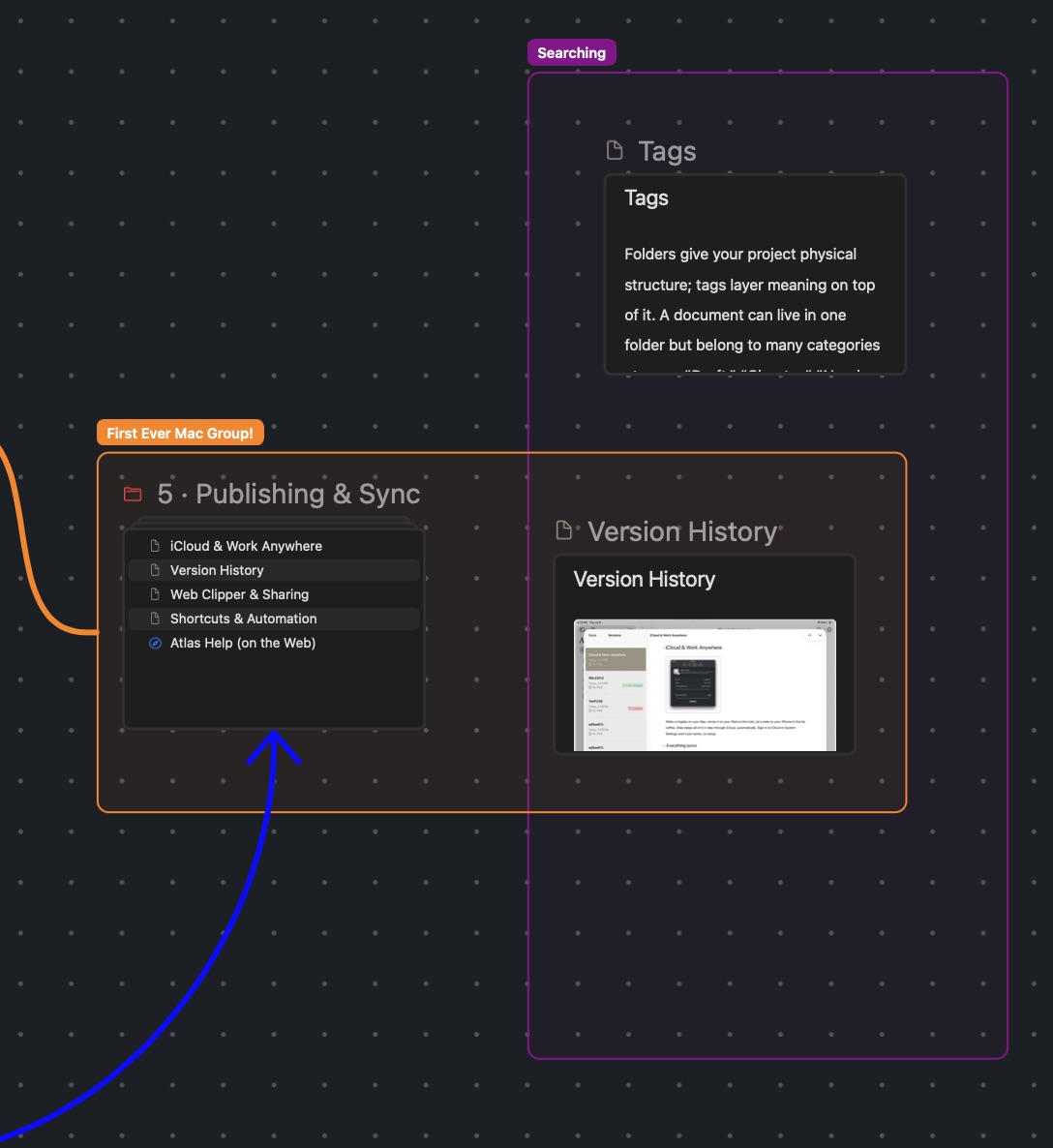
Groups on a Canvas
A group is a labeled frame that gathers related items. Use groups to mark out a storyline, a set of characters, or a stage of a process, and move the whole collection together.
To create a group:
- Select two or more items and choose Create Group from the selection bar. Atlas frames the selection.
- Choose Create Group from the background menu to place an empty group and drag or resize it around what you want.
- Choose Editor > Canvas > Add to Canvas > Create Group or press Ctrl+Cmd+G. This frames the current selection, or creates an empty group if fewer than two items are selected.
A new group asks for a name right away. You can rename it any time from its selection bar, and the label sits above the frame. Groups can be recolored like cards.
Membership follows position. Any card, text block, or pin that overlaps a group belongs to it, and moving an item in or out of the frame changes its membership. A group that sits entirely inside a larger group is nested in it, at any depth. Dragging a group moves everything inside it, and locking a group locks its contents too.
A group's selection bar and menu offer:
- Rename and Change Color
- Select Contents to select every item inside without moving anything
- Resize to Fit Contents to wrap the frame around what is inside
- Align Contents to tidy the items inside the group (see Aligning and Arranging)
- Delete Group, which removes the frame and leaves its items on the canvas
Groups appear in canvas previews, in the Inspector, and in search. See Finding Canvas Items.
Connecting Items with Connections
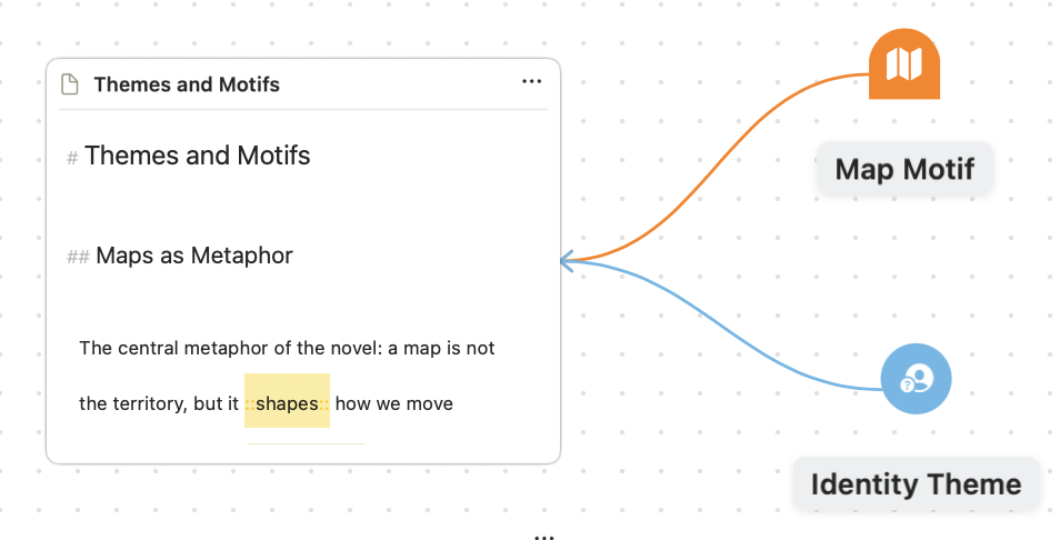
Connections between pins and a card
Draw connections between any two items to show relationships, dependencies, or flow. To create a connection, select a canvas item so connection chevrons appear on each of its sides, then drag from one of them to another item. Connections can attach to cards, pins, folders, and groups. Connections can be moved from either end to new sides or items by selecting the connection and dragging either endpoint.
Pins don't show chevrons when selected. Choose Add Connections from a pin's selection bar to reveal them until you deselect the pin.
Select a connection to customize it from its selection bar:
- Arrows — Turn the Start Arrow and End Arrow on or off, letting you create directional, bidirectional, or undirected connections.
- Labels — Add a text label to any connection with inline editing.
- Colors — Customize each connection's color individually.
Connections stay a consistent thickness as you zoom, and shrink only when you zoom far out. When a connection runs between a pin and the side of a card that faces it, Atlas slides the attachment point to keep the line straight if they are nearly lined up.
Info
Atlas prevents self-connections, duplicate connections, and bidirectional connections on the same pair to keep your canvas clean.
Selecting, Moving, and Arranging
Selecting Items
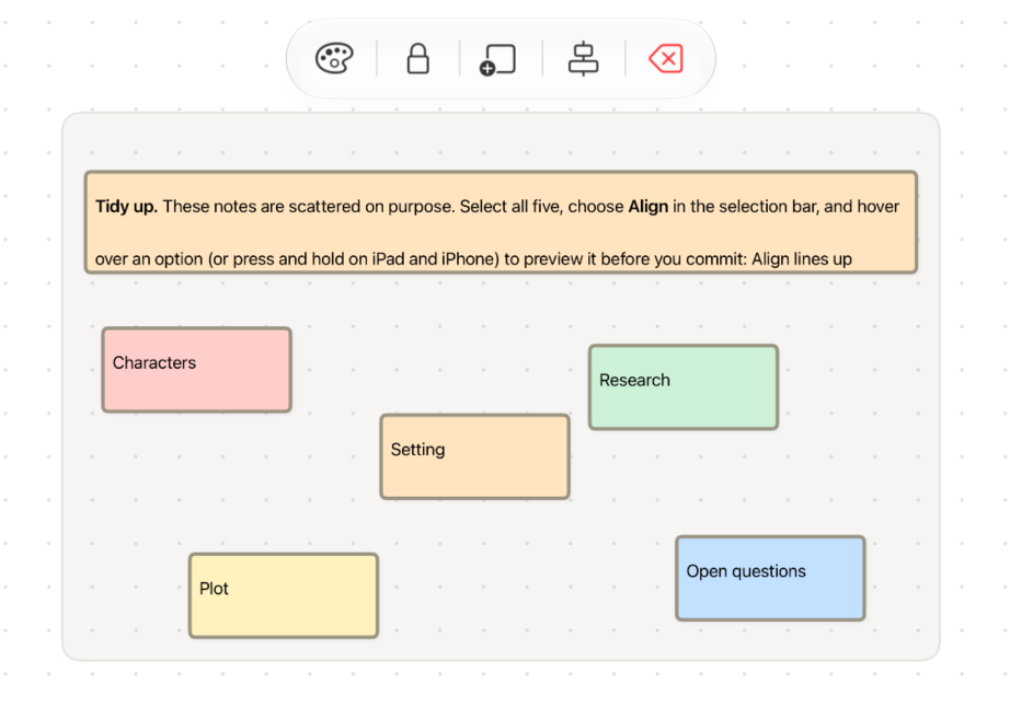
Multiple Selection
Click or tap an item to select it. To select more than one:
- Hold Cmd or Shift while clicking or tapping to add an item to the selection or remove it
- Drag on empty canvas to draw a selection box on Mac. On iPad and iPhone, touch and hold empty canvas, then drag. Hold Shift to add to the current selection. The box selects everything it touches, but it selects a group only when the box fully encloses it, so you can select the items inside a group.
- On iPad and iPhone, tap an item with two fingers to add it to or remove it from the selection
With several items selected, the selection bar offers actions for the whole set, such as changing color, locking, grouping, aligning, and removing. Click empty canvas to clear the selection. Press Esc to cancel a drag, resize, selection box, or connection you're in the middle of.
To remove the selected items on Mac, press Del or use the selection bar. Atlas asks you to confirm.
Moving and Resizing
Drag any selected item and the whole selection moves together, including the contents of any selected group. Locked items stay in place. When you drag an item near the edge of your view, the canvas scrolls automatically.
To resize, select a single item and drag a handle. Handles fade out when you aren't using them. Tap or click the item, or press a faded handle, to bring them back. Hold Option while resizing to resize from the center. Media and sketch cards keep their proportions.
Nudging
Select one or more items and press an arrow key to move them by a small step. Hold Shift for a larger step. With Snap to Grid on, each press moves to the next grid line. Locked items don't move. On iPad and iPhone, nudging needs a hardware keyboard.
Snapping to the Grid
Snap to Grid keeps items tidy as you move, resize, nudge, and place them. It is on by default, and you can turn it on or off in Canvas Options or under Editor > Canvas > Grid. It works even when the grid itself is hidden.
Hold Cmd while dragging or resizing to do the opposite of your setting. With snapping on, Cmd lets you move freely. With snapping off, it snaps just that drag. Items you add through the Share extension, Web Clipper, or Shortcuts land beside the newest card on the canvas, aligned to the grid when snapping is on.
Aligning and Arranging
Select two or more items and choose Align from the selection bar, or find the same commands under Editor > Canvas > Align. The popover groups its commands into three sections:
- Align — Line items up along their left, center, right, top, middle, or bottom edge
- Arrange — Lay items out in a row, a column, or a grid
- Distribute — Space items evenly, horizontally or vertically. Distribute needs three or more items.
On Mac, hover over a command to preview the result on the canvas before you apply it. On iPad and iPhone, touch and hold a command to preview it, or tap to apply. The popover stays open so you can chain commands. Each command is a single undo, and locked items stay put. Nothing is resized.
For a group, choose Align Contents to arrange the items inside it within the group's frame. If your selection includes groups, each group moves as a block with its contents. The keyboard shortcut for each command appears in the Editor menu and in the Keyboard Shortcuts guide.
Navigating the Canvas
Scroll or pan to move around the canvas. Pinch to zoom, or hold Cmd and scroll on Mac, or on iPad with a keyboard or trackpad, to zoom toward the pointer. Two-finger drag and trackpad scrolling scroll a selected text card's contents rather than the canvas. On iPad and iPhone, the sidebar and Inspector swipe gestures are turned off while a canvas is open, so they don't compete with dragging.
The zoom control sits in the bottom-left corner:
- Use the magnifier buttons to zoom out or in
- Click or tap the percentage to type an exact value from 10% to 300%. Press Enter to apply, Esc to cancel, or use the up and down arrows to change it in steps of 5%.
- Open the presets menu next to it for common zoom levels
- Use the fit button to frame your content. With items selected, it frames the selection instead. Its menu offers Fit to Contents, Fit to Selection, and Center to Canvas.
On Mac, View > Canvas has Fit Contents (Cmd+1) and Fit to Selection (Cmd+2). On iPad they're available with a hardware keyboard.
Zoom far out, to about 30% or less, and Atlas switches to overview mode. Document and folder cards fade their text and show just an icon and title, so a large canvas stays readable at a glance.
Opening an item from the Inspector, search, or a link centers your view on it. Double-click or double-tap a nested canvas card to open that canvas.
The Canvas Inspector
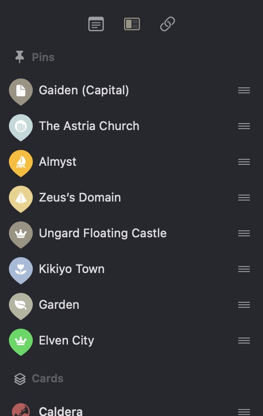
A Inspector showing the Canvas Section on macOS
When viewing a canvas, the Inspector includes an Items tab showing all items grouped by type: Pins, Cards, and Groups. Items inside a group show a small dot in the group's color. Select any item to navigate to it on the canvas. See The Inspector for details.
Finding Canvas Items
You don't have to remember which canvas a pin or card lives on. Individual canvas items (cards, pins, text blocks, and labeled groups) are indexed alongside your documents in both Atlas search and system Spotlight, matched on a card's referenced document title or a pin, text block, or group's text. Pins and labels need some text to be findable.
Choosing a result takes you straight to the item: Atlas opens its canvas and focuses it. In search results and links, a canvas item reads as "Canvas Name › Item Name," so you can tell where it lives at a glance.
To search inside a group, use the In Group token. Type a group's name and choose the suggestion to see everything inside that group, including items in nested groups. See Searching for the full set of search tokens.
Canvas Settings
Open Canvas Options to customize the canvas. On Mac it's the button in the add bar, and on iPad and iPhone it's in the navigation bar.
- Accent color — Sets the color of the selection frame, resize handles, and selection box, and the grid. Choose Reset to return to the system accent color.
- Show grid — Toggle grid visibility
- Grid style — Choose between dots (default) or lines
- Snap to grid — Snap items to the grid as you move, resize, and place them
Atlas adjusts custom canvas colors that would be hard to see in light or dark mode, keeping the same hue. To turn this off, use Adjust Colors for Legibility in your general settings.
Exporting
As an Image
Export your canvas as a PNG image from Canvas Options or Editor > Canvas > Export Canvas:
- Export Full Canvas — Every item on the canvas
- Export Current View — Only the part of the canvas you see, at the current zoom
As a Bundle and in JSON Canvas Format
Export as Bundle saves the canvas in the JSON Canvas open format, together with the media it uses. Atlas canvases are compatible with this specification. Import .canvas files from other apps like Obsidian, or export your canvases for use elsewhere. Supported node types include text, file, link, and group nodes, along with full connection support. Groups keep their frames, labels, and colors when you export and import.
See Canvas Workflows for practical tips on using canvases effectively.
See Also
- The Organizer — Drag documents onto the canvas from here
- The Inspector — The canvas Items tab
- Searching — The In Group token and other search filters
- Canvas Workflows — Practical patterns for canvas use
- Keyboard Shortcuts — Canvas shortcuts